CASE — 01 / AIR FRANCE-KLM / 2024 — 2026
Designing passenger, agent, and airport experiences at airline scale
— AT A GLANCE
ROLE
Lead Product Designer
UX Lead (freelance)
SCALE
125+ airports
Global service operation
TIMEFRAME
2024 – 2026
Self‑service kiosks
Digital Airport @ Schiphol
CSC360 Salesforce console
PRODUCT DOMAINS
FOCUS
Designing for high-pressure, time-critical environments where clarity and confidence directly affect the passenger and agent experience
OUTCOME
CSC360 is live and in daily use by 5,000+ service assistants worldwide.
The rebooking status page was launched in February 2026 after a validated field experiment at Schiphol.
Redesigned kiosk experience in the final design stage, rollout at 125+ airports planned for 2027.
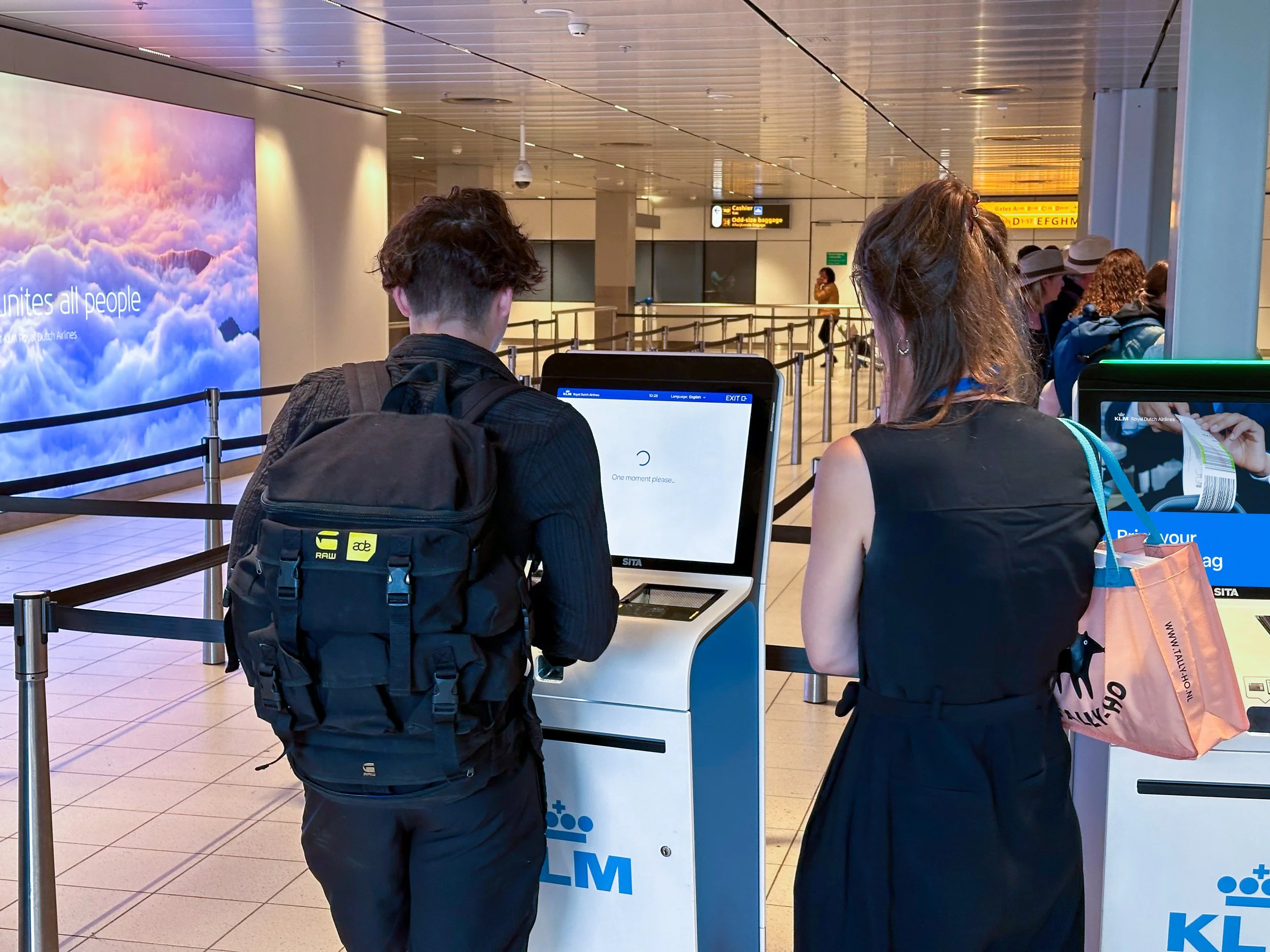
At Air France-KLM, I managed UX across three product areas that together shape the entire airport experience: self-service kiosks used by passengers at more than 125 airports worldwide, KLM's digital airport screens at Schiphol, and CSC360, a Salesforce-based customer care platform supporting over 5,000 service agents across multiple continents. All three operate in high-pressure environments where speed, clarity, and confidence directly impact the experience, whether for a passenger checking in, a traveler facing a canceled flight, or an agent handling a complex case.
— MY CONTRIBUTION
I redesigned core kiosk flows for check-in and bag tagging, rethinking how the kiosk addresses and guides passengers based on a year of observation and research. For Digital Airport, I challenged the initial brief for a disruption information screen and proposed a behavioral approach that led to a validated, launched product for real-time rebooking visibility. For CSC360, I designed custom components and workflow patterns on top of the Salesforce framework, consolidating five separate consoles into one unified environment, with end users closely involved throughout. Across all three domains, I worked closely with product owners, engineering, UX research, and business stakeholders to align design decisions with platform constraints and operational realities.
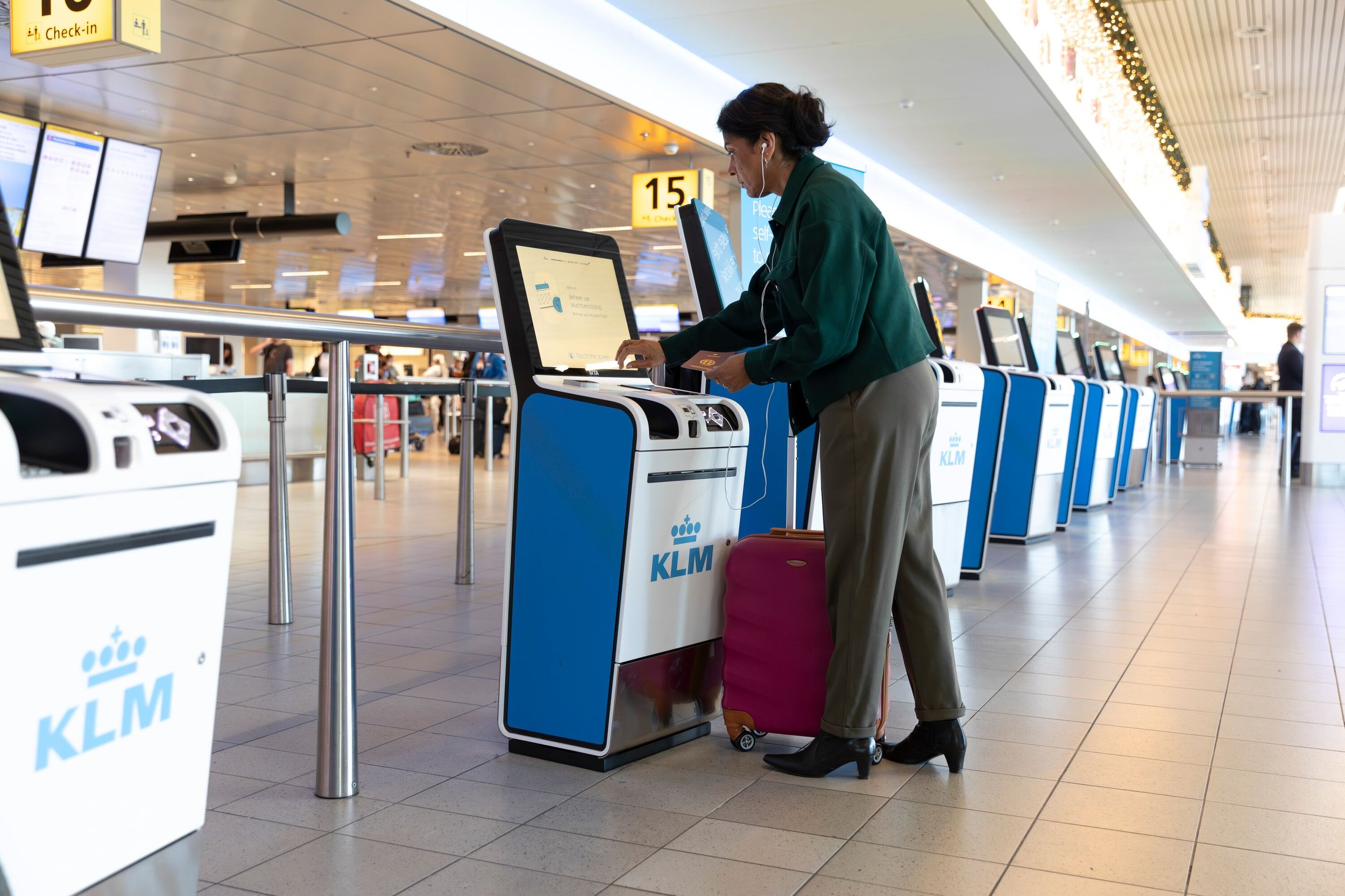
Self-service kiosk
Redesigning self-service kiosk journeys to build passenger confidence through clearer, more personal interactions.
— WHERE IT STANDS
A year of observation at Schiphol and Charles de Gaulle showed the core problem was trust, not functionality. The redesigned experience is now in final design, with agent validation sessions scheduled before rollout at 125+ airports in 2027.
— CONTEXT
Air France–KLM operates passenger self-service kiosks at over 125 international airports, supporting check-in, seat selection, bag-tag printing, and a broader range of flight-related tasks. These kiosks are used by large numbers of passengers every day, often under time pressure, in unfamiliar environments, and with little room for error.
At the same time, several developments came together: the launch of new kiosk hardware, early trials with conversational AI, and the introduction of a new KLM design language, offering an opportunity to fundamentally rethink the kiosk experience.
— THE CHALLENGE
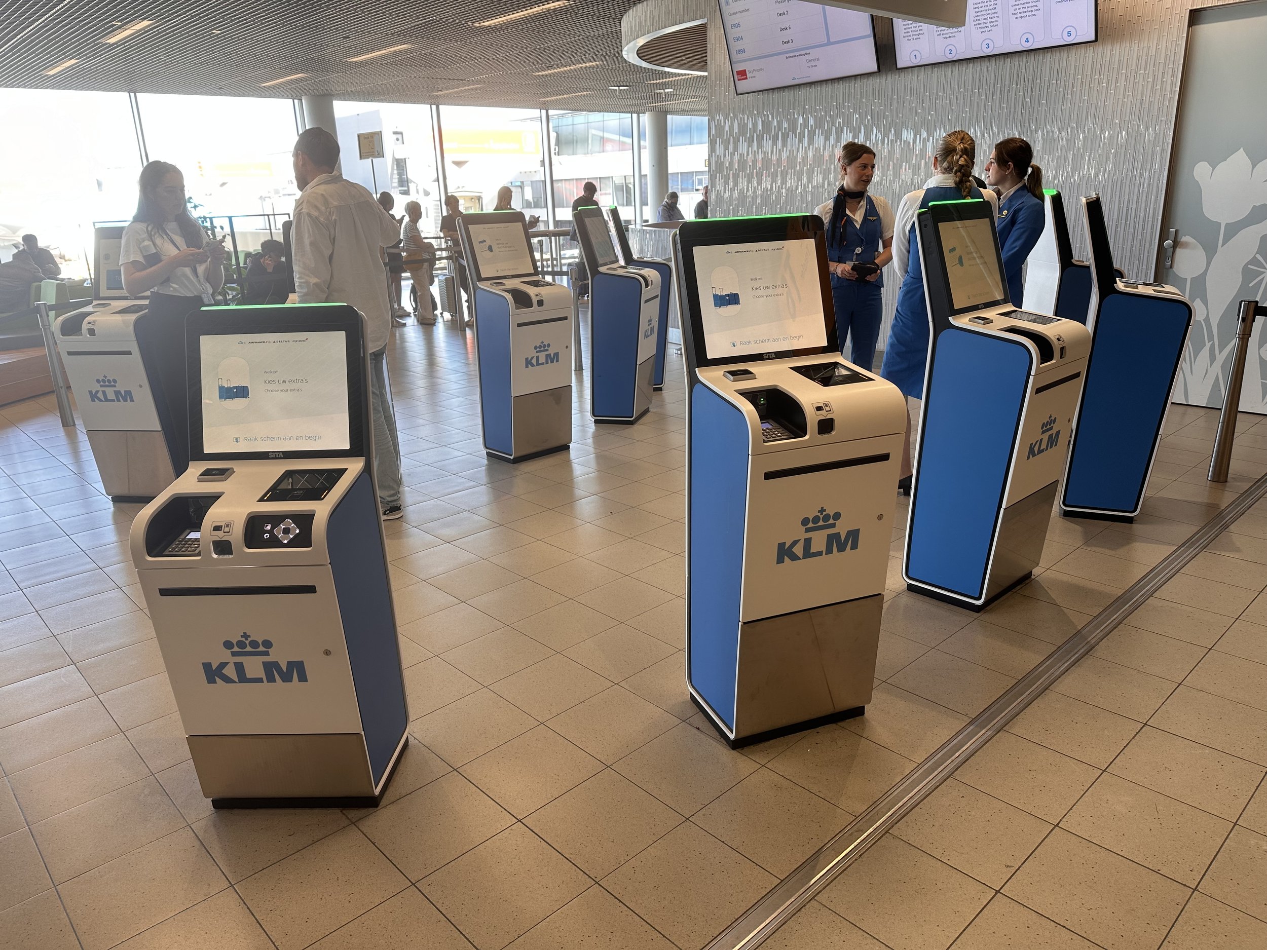
Together with a dedicated UX researcher, we spent a year observing real passenger behavior at Schiphol and Charles de Gaulle. This included direct observation at kiosks, questionnaires with passengers, and knowledge sessions with airport agents, the people who stand next to the kiosks every day and assist passengers when they get stuck.
The findings were clear. The main issue wasn't missing functionality; it was trust. Passengers approached the kiosk hesitantly, viewing it as an impersonal, generic device and doubting it could actually help them. Many preferred to wait in line for a human agent, even when the kiosk could handle their request.
Agents confirmed this pattern, describing how passengers often felt "unseen" by the kiosk, greeted with a cold request to scan a passport rather than any acknowledgment of who they were or what they needed.
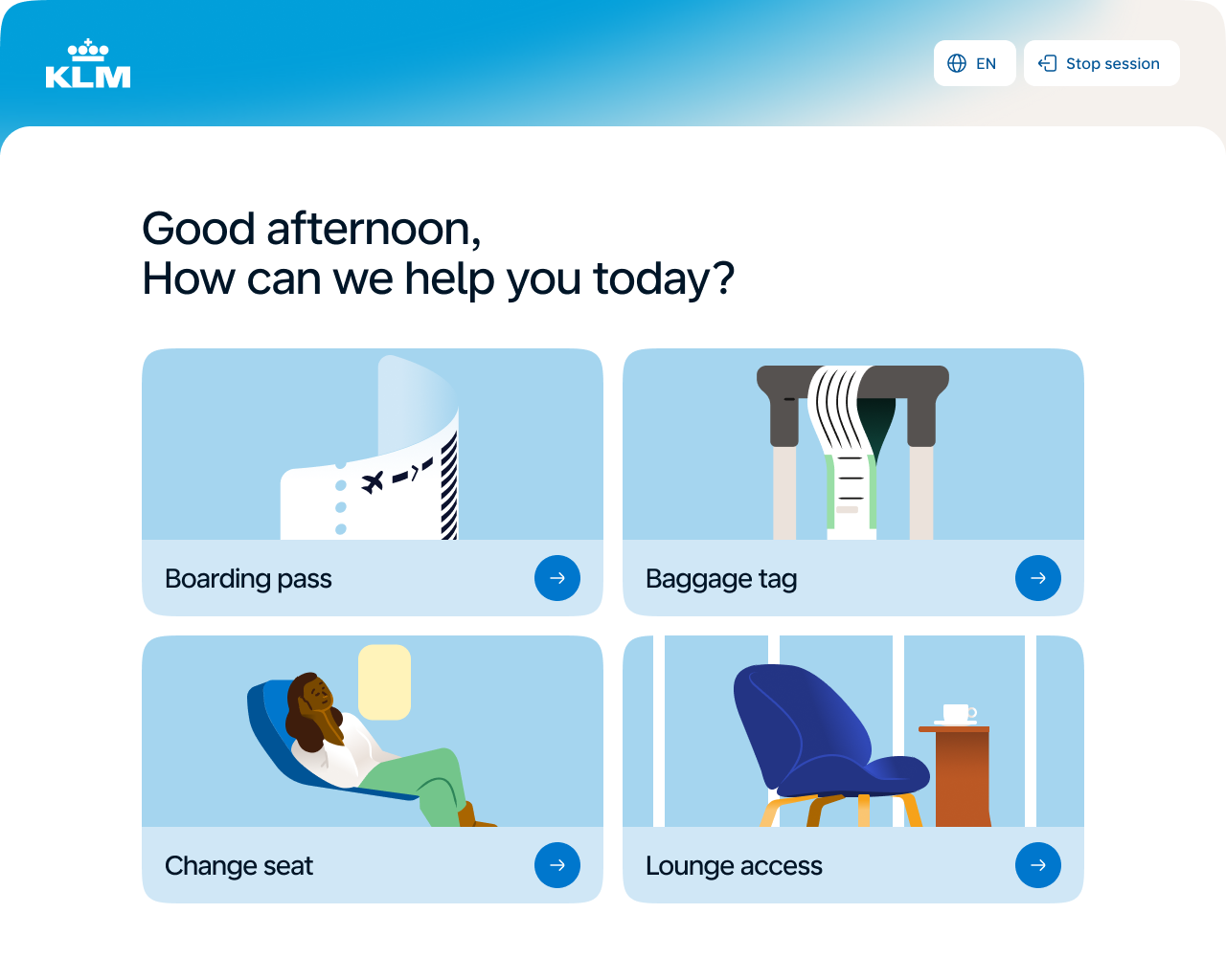
When a passenger approaches an airport agent, the first thing they hear is: "Good afternoon, how can I help you?" When they approach a kiosk, the first thing they see is: "Insert your passport." That gap in tone highlights the trust issue.
— APPROACH
Building on this insight, we reimagined the kiosk experience around a key principle: the kiosk should act more like a helpful guide rather than a system.
This led to three main design directions:
Tone of voice. Replace system language with conversational language. Instead of beginning with an identification, the kiosk now opens with a question: "How can we help you today?" This mirrors how an agent would greet a passenger.
Recognition and reassurance. When a passenger is identified, the kiosk greets them by name and displays their flight details instantly. This builds trust: the kiosk shows it knows who you are, where you're headed, and that it can assist, just like an agent would after checking your passport.
Right question, right moment. Restructuring the flow to follow the passenger's natural state of mind instead of the system's logic. Questions now appear in the order a passenger would expect them, not in the order the back-end requires.
These changes were supported by a refreshed visual design aligned with KLM's new design language, which is warmer, more modern, and intended to feel welcoming rather than clinical.
— STATUS
The redesigned kiosk experience is currently in the final design stage, with agent validation sessions scheduled before rollout at over 125 airports in 2027.
— WELCOME SCREEN
The kiosk opens with a question, not a command:
How can we help you today?
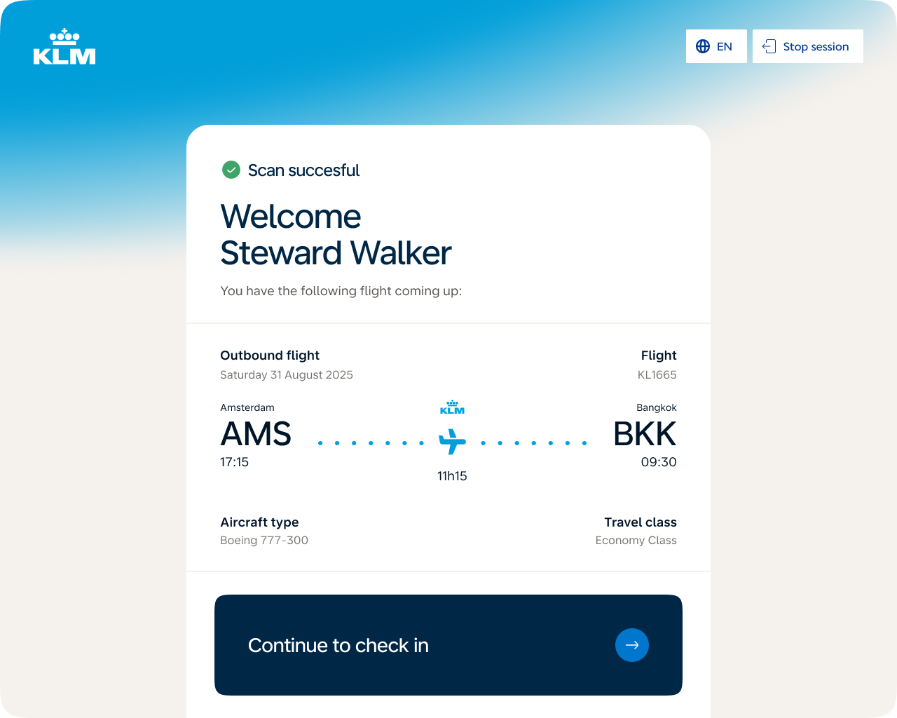
— IDENTIFICATION
After scanning, the passenger is greeted by name and immediately sees their flight details. The kiosk demonstrates that it knows who you are and where you're going, building the same trust an agent would after receiving your passport.
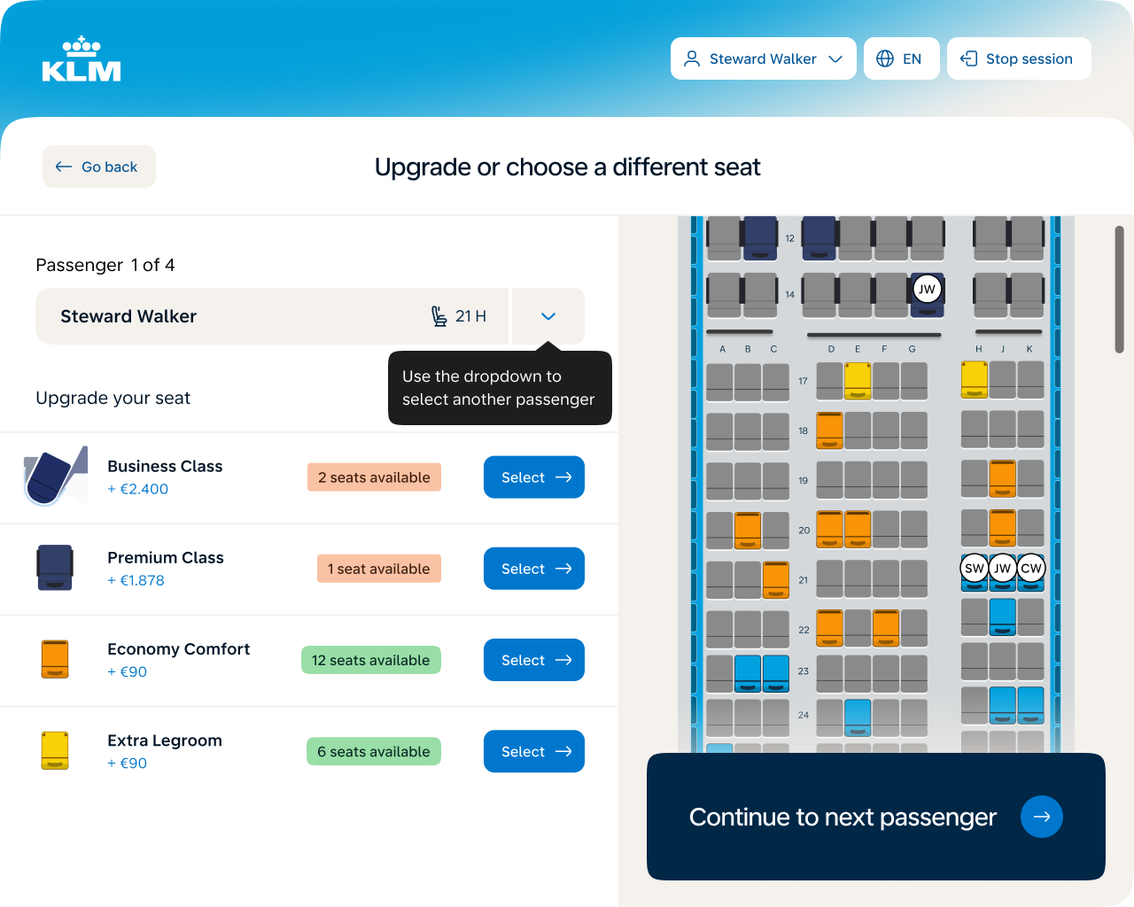
— SEAT SELECTION & UPGRADE
Seat selection combines upgrade options, availability, and pricing in one view, replacing a tap-to-discover model that asked too much of passengers under time pressure. Transparency supports both faster decisions and higher upgrade conversion.
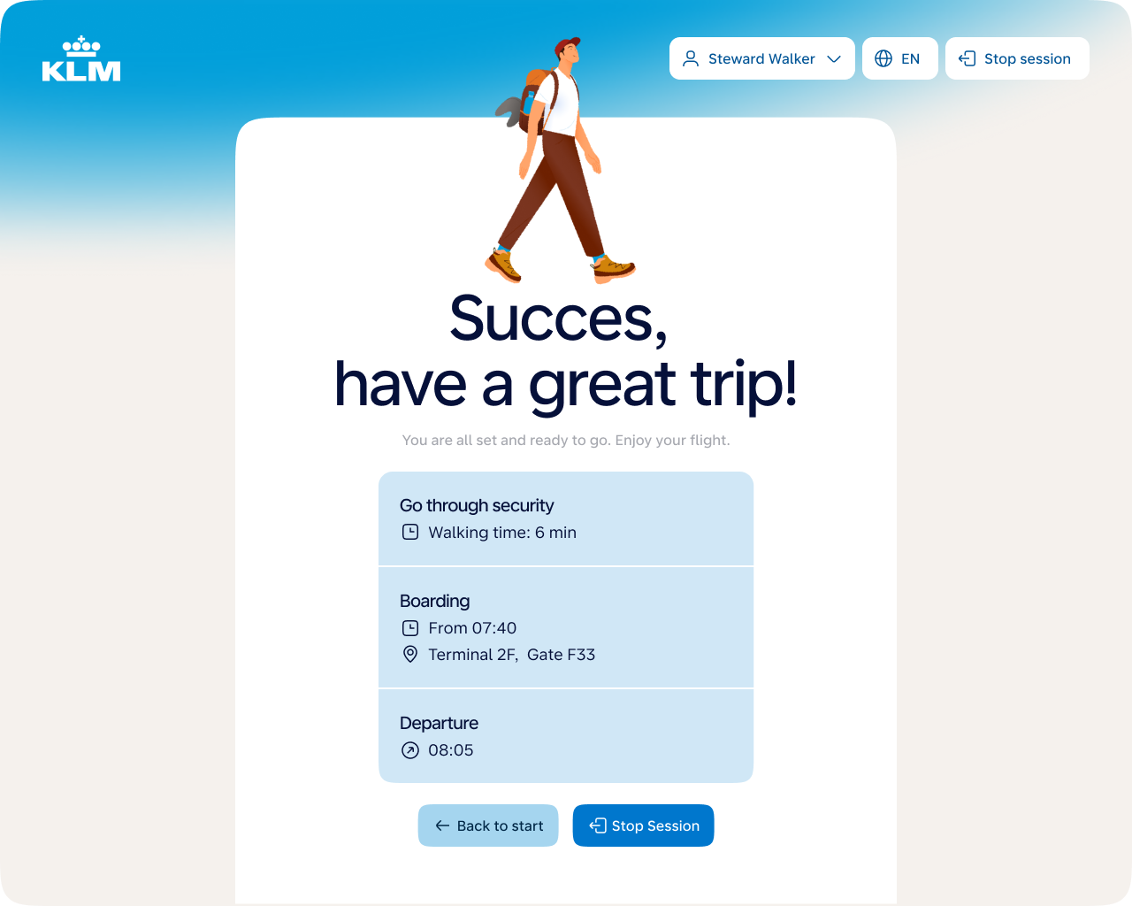
— SEND-OFF SCREEN
The send-off screen closes the experience on a personal, reassuring note, giving passengers clear next steps (security, boarding time, gate) and the confidence that everything is taken care of.
Digital Airport
Reducing passenger uncertainty during flight disruptions through real-time rebooking visibility.
— WHERE IT STANDS
I challenged the original brief, proposed a personal and portable alternative, and validated it in a live experiment at Schiphol rather than in a meeting. The rebooking status page launched in February 2026.
— CONTEXT
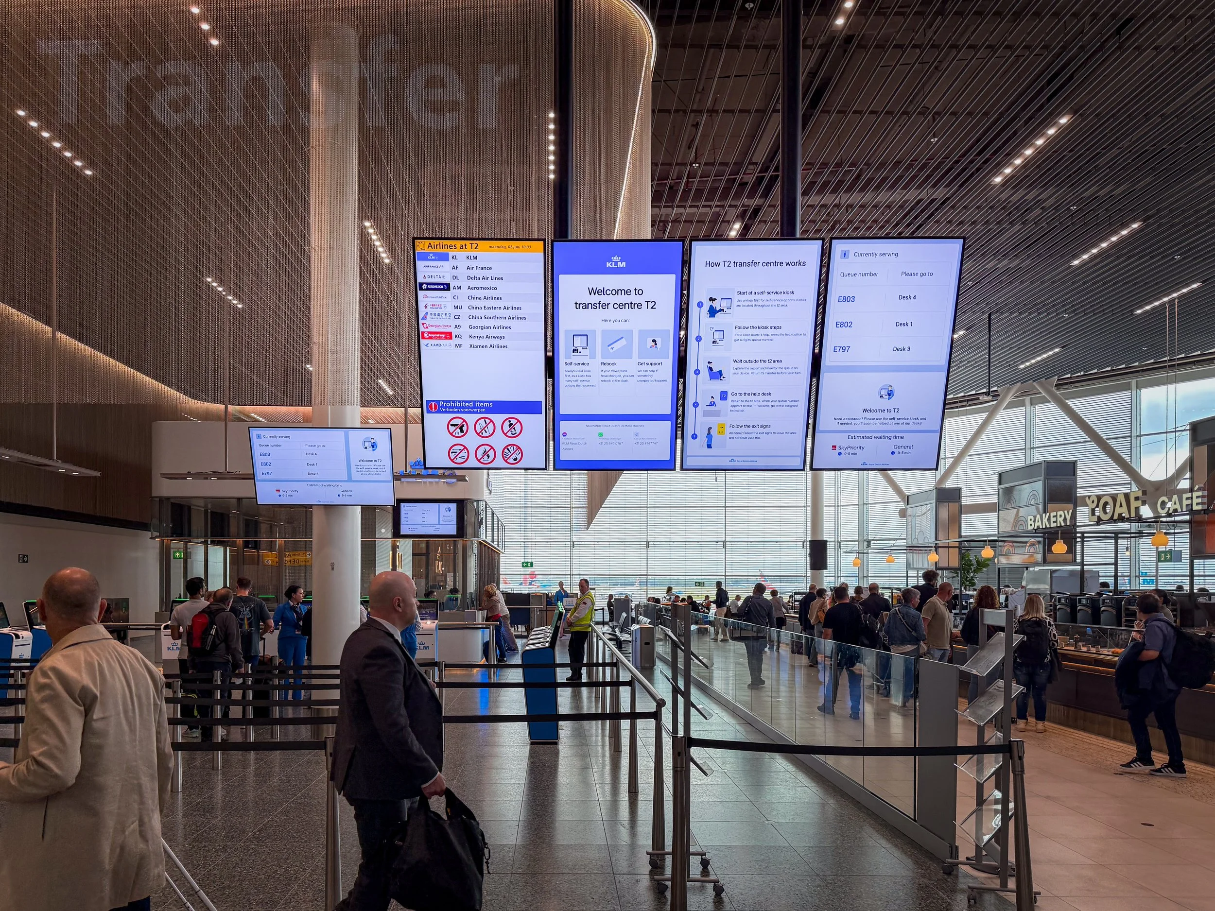
As part of KLM's Digital Airport team, I oversaw the design of KLM's digital screens at Schiphol Airport. One of the most significant projects in this area focused on flight disruptions, moments when passengers are most stressed and least informed.
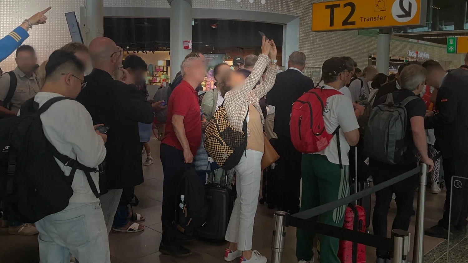
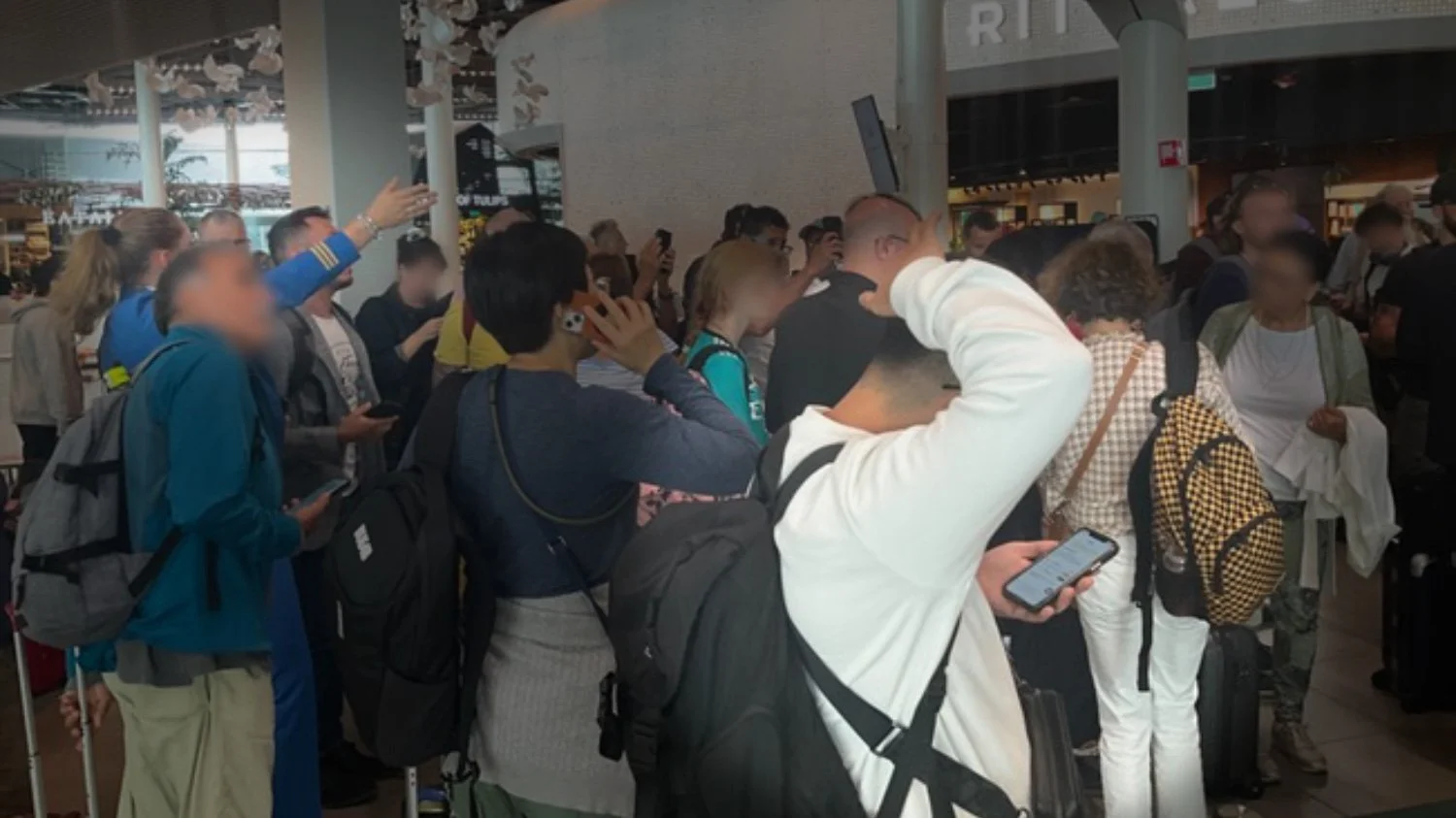
When flights are canceled, Transfer Centers quickly become crowded. Rebooking is handled automatically behind the scenes, but many passengers are unaware of this. They stay near the Transfer Centers, either queuing or seeking reassurance from staff, even when no immediate action is necessary.
— THE INITIAL REQUEST
(and why I challenged it)
The original request was to display rebooking statuses of canceled flights on the public screens near the Transfer Centers.
From a UX perspective, I argued that this would reinforce the current behavior. If the information remains on a screen at the Transfer Center, passengers have no reason to leave.
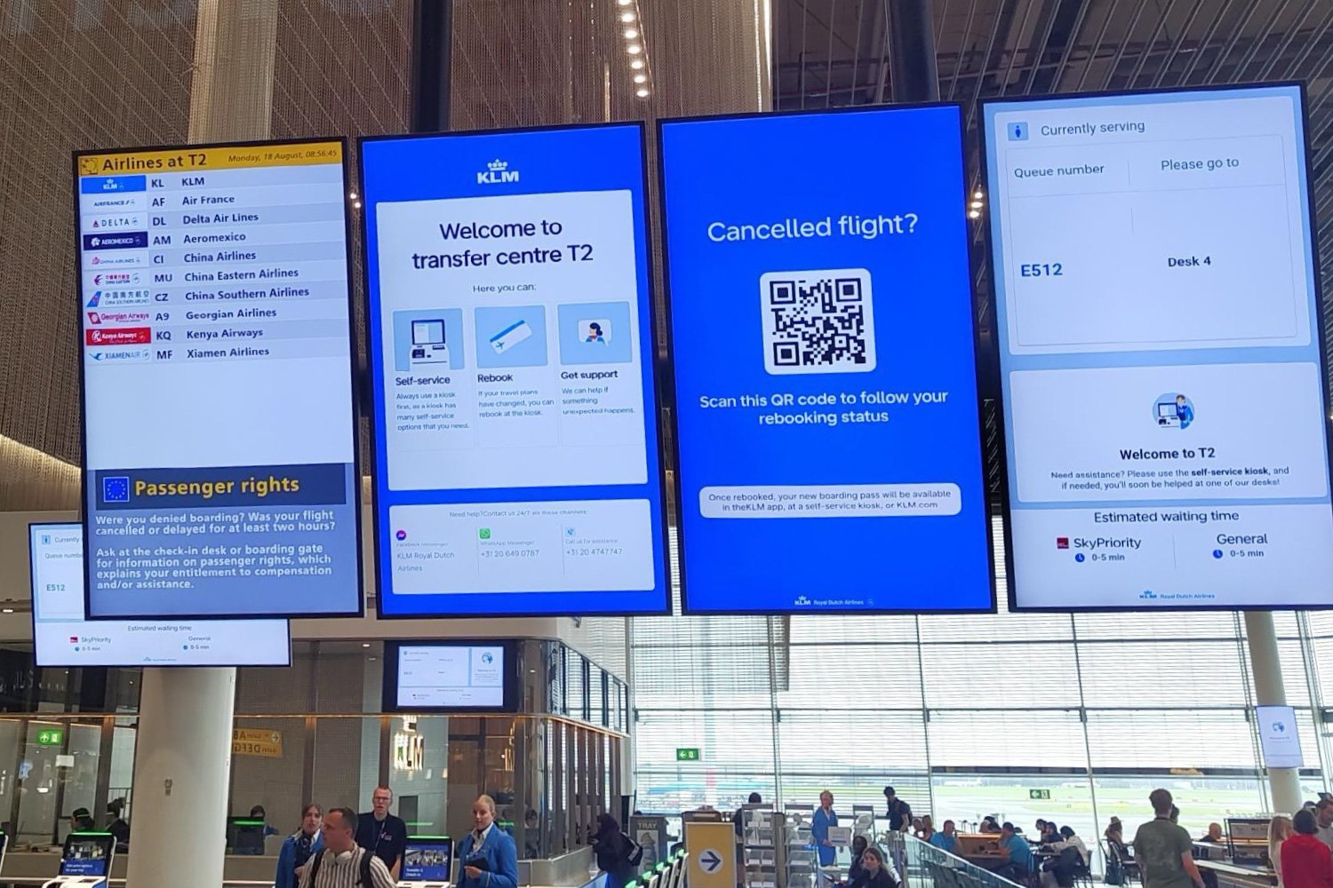
I proposed a different method: a disruption screen with a single, prominent feature: a highly visible QR code that guides passengers to a personal, real-time rebooking status page on their own device. If the goal is to influence physical behavior, the information must become personal and portable.
The idea was well received, but some raised concerns that a screen showing "only" a QR code might not be enough, an instinct often driven by stakeholders wanting to display as much as possible to avoid missing anything. Instead of debating this in the abstract, I recommended a live experiment at Schiphol to test the concept in real-world conditions.
When passengers understand that rebooking is automatic, can see their flight status in real time, and know no immediate action is needed, perceived uncertainty decreases, reducing the need to stay at the Transfer Center.
— A LEAN EXPERIMENT by design
To minimize development effort, I designed the experiment to be as simple as possible. The disruption screen was implemented by changing the URL on existing airport screens. For the mobile rebooking status page, I collaborated with the business analyst and developers to create a straightforward HTML page hosted on the KLM.com domain, which is important for passenger trust. This page was connected to a lightweight CMS that allowed us to update flight numbers and rebooking statuses in real time from the back office. No API integration with the rebooking systems was required; instead, we manually updated statuses while working alongside the rebooking agents.
This method saved approximately 31 story points in development while completely validating the hypothesis with actual passengers.
— FINDINGS
We conducted testing at Schiphol across Terminal 2 and Terminal 4 on a single day, with UX Research closely involved.
During active cancellations, passenger interaction with the QR code increased noticeably. Over the course of the test, about 72 unique passenger interactions were recorded. Interview feedback confirmed the concept: passengers said seeing their specific flight on the mobile page was reassuring.
A consistent physical shift away from the Transfer Centers was less conclusive, showing that digital reassurance is effective, but changing spatial behavior also depends on operational alignment. Agents were not yet trained to refer passengers to the digital touchpoint, a gap that Digital and Operations recognized as essential for full impact.
— OUTCOME
The experiment confirmed the concept. The rebooking status page was launched in February 2026.
“We collaborated closely on the implementation of the new Flight Disruption Screen, where Michael went well beyond the traditional scope of a designer. His strategic vision for the product challenged our initial direction, ultimately resulting in a solution that better aligned with our operational goals, customer needs, and user behavior.”
Nick Richard, Product Owner Digital Airport, Air France-KLM
— QR CODE ON SCREEN
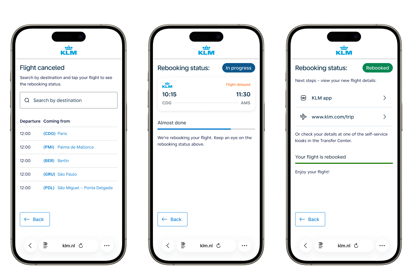
The disruption screen appears automatically when a cancelled flight's passengers arrive at the Transfer Centre, showing a single clear action: scan to follow your rebooking status.
— UPDATING FLIGHT STATUS
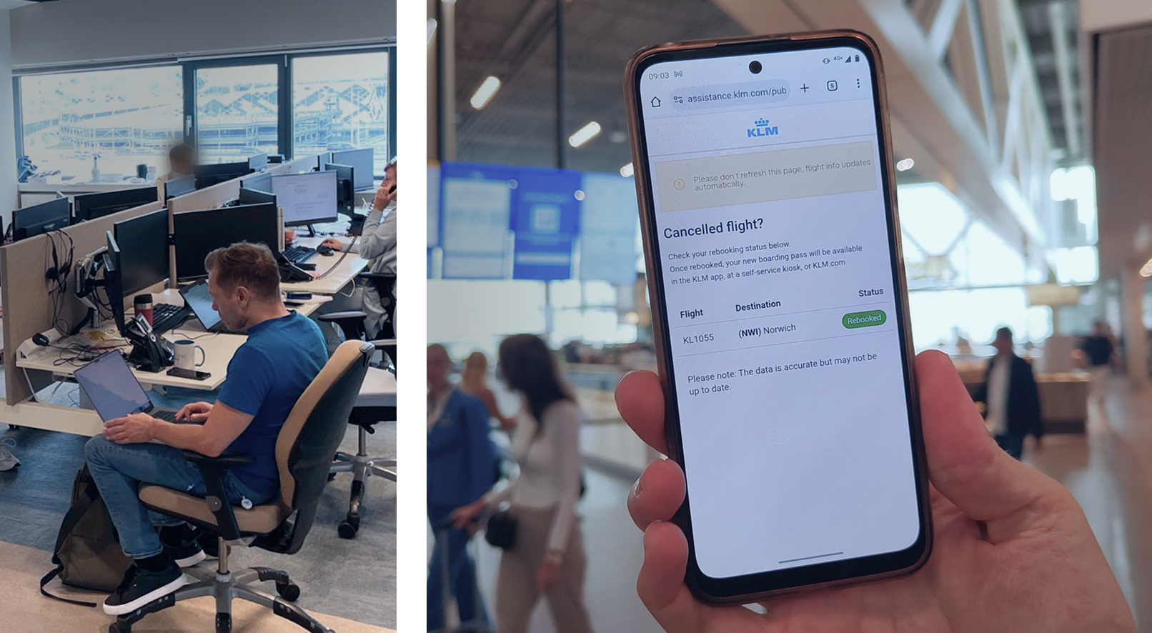
During the experiment, I sat alongside the rebooking agents at Schiphol, manually updating flight statuses in real time. Passengers saw the changes appear on their phones within seconds.
— MOBILE WEBSITE
The mobile rebooking status page after scanning the QR code. Three clear states (cancelled, in progress, rebooked) give passengers real-time visibility without needing to queue or ask staff.

Customer Service platform (CSC360)
Building a unified service console on Salesforce for 5,000+ agents worldwide
— WHERE IT STANDS
Five consoles consolidated into one, now used daily by over 5,000 service assistants worldwide. A key user program of 80 to 100 participants shaped the design and carried adoption. Replacing OSCAR as a daily habit is still in progress.
— CONTEXT
Before CSC360, Air France–KLM's customer care operation used five separate Salesforce consoles: three for the French market, one for email and phone, and one for social media. Each had its own workflows, interaction patterns, and interface conventions.
Service representatives worked in silos. A social media specialist had never used the phone console, and vice versa. Switching between channels or handling cases that crossed channel boundaries was slow, mentally taxing, and inconsistent.
An external analysis had identified the main friction points across these five consoles. Based on this, the decision was made to unify everything into a single new console, CSC360. That was my starting point.
— THE CHALLENGE
The biggest challenge wasn't technical; it was organizational. Assistants worked under high pressure with strict performance targets. They were deeply familiar with their own console and resistant to change. Asking them to adopt a completely new way of working was a significant request.
We knew that designing the right interface wouldn't be enough if the users felt it was forced on them.
Adding to this complexity: because the existing consoles failed on many fronts, assistants had trained themselves to do much of their work directly in OSCAR, an industry-wide booking tool used across aviation for managing passenger flight records. OSCAR was never meant to be a service console, but it had become a deeply ingrained workaround. CSC360 didn't just need to replace five consoles; it had to be good enough that assistants would voluntarily stop relying on OSCAR for tasks that CSC360 now handled more effectively.
If 5,000 agents are expected to change how they work, they need to be involved in shaping what they're changing to. Designing the right interface isn't enough if the people using it feel it was imposed on them.
— APPROACH
key user from day one
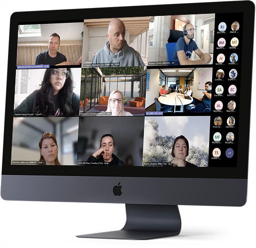
To avoid designing solely on business assumptions, we established a key user program from the outset. We invited service assistants from call centers across Europe, Asia, Africa, and South America to participate directly in the design process.
Early on, the emphasis was on listening: understanding how each console was used in practice, where friction occurred, and what assistants considered essential. As designs developed, we validated them with this group before development, using their feedback to challenge our assumptions and guide decisions.
Over time, the group grew to 80–100 active participants. Their involvement not only improved the design but also fostered buy-in. Key users became ambassadors within their own centers, which proved essential for adoption when CSC360 launched.
— DESIGN DECISIONS
shaped by key users
Two examples that demonstrate how this worked in practice:
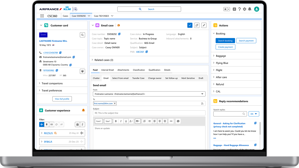
The customer card. Our initial approach was to minimize the information displayed on the first screen, showing only what was relevant for the majority of cases and hiding the rest behind a "View full profile" button. We removed physical address details, assuming they were far less important than email, phone, or Flying Blue number. Key users corrected us: the physical address was consulted frequently enough that hiding it created unnecessary friction. We adjusted.
Flying Blue information. We placed Flying Blue details inside a collapsed accordion, assuming assistants could open it when needed. Feedback was immediate: Flying Blue data is consulted frequently, so requiring an extra click each time would cause daily frustration. We moved it back to a visible position.
Both examples confirmed the value of the approach: we had a clear design rationale (minimize), but we let real users challenge it and adjusted when their evidence was stronger than our assumptions.
— CUSTOM COMPONENTS
for Air France-KLM
Standard Salesforce framework components didn't handle the operational complexity of airline customer care. I created several custom components that became core parts of the CSC360 experience:
Customer card, consolidating passenger identity, contact details, Flying Blue status, miles balance, and travel companions into a single persistent view. Designed to give agents immediate context at the start of any case, informed directly by key user feedback on what needed to be visible without clicks.
Customer Experience, a timeline of the passenger's complete travel record: past, current, and future flights, with inline access to ticket details, cabin class, flight status, refund status, claims, disruption communications, miles mutations, and crew-to-agent messages (Customer Attention Loop). Selecting any flight gives the agent one-click access to all related data sources, eliminating the need to switch between tools or pages.
Actions, a contextual action panel that predicts the most likely tasks based on the current case. If a passenger hasn't checked in but is a Flying Blue member, the component automatically opens the relevant sections and highlights the most probable actions. This reduces search time and keeps agents within CSC360, rather than jumping between tools.
— OUTCOME
CSC360 combined five consoles into one unified environment, now used daily by over 5,000 service assistants worldwide. The key user program played a crucial role in ensuring adoption: centers responded well to the new console, primarily because assistants were involved throughout the process.
Fully replacing OSCAR as a daily practice remains an ongoing effort. This is expected: after relying on a workaround for years, adoption is not a single event but a gradual transition, driven by continuous improvements to CSC360 to the point where reaching for OSCAR feels unnecessary. Features like Customer Experience and Actions were specifically designed to support this goal: keeping assistants within CSC360 by making the information and actions they need accessible without leaving the console.
“Michael helped establish a strong, structured collaboration with our end users, ensuring they were actively involved throughout the process, resulting in high adoption and a solution that truly meets their needs. He also created clear design principles that guided us in product decisions and discussions with business.”
Alexander Perlstein, Product Owner CSC360, Air France–KLM