CASE — 04 / RTL / 2012 - 2018
Building the department, the platform and the brand identity that shaped RTL's digital decade

— AT A GLANCE
ROLE
Design Director / Creative Director
TIMEFRAME
2012 - 2018
LOCATION
Hilversum
TEAM
Multidisciplinary team of designers and frontend developers
SCOPE
Digital extensions of RTL's TV shows · Videoland rebrand and launch · RTL Nederland rebrand rollout
— CONTEXT
RTL Nederland decided to consolidate its creative talent into a single department. Designers and frontend developers who had worked independently across the organisation were brought together under one roof. I was brought in to lead that department.
The mandate was clear in principle but open in practice: build a team the business could rely on, and prove that working with this department was the right choice — creatively, operationally, and commercially.
— CHAPTER 1: BUILDING THE TEAM
When I arrived, the people were there. What wasn't there yet was a team.
Individuals who had worked autonomously for years now shared a department. Getting them to function as a cohesive unit — one that trusted each other, took ownership, and could carry complex projects independently — took over a year of deliberate work. This meant coaching, redefining roles where needed, and in some cases making difficult decisions about fit.
Alongside the internal work, I spent considerable time building trust with the business. Internal clients needed to be convinced that commissioning work from us was the smarter choice over external agencies. Over time, that trust became the foundation for everything that followed.
It is about creating the conditions in which good work becomes possible.

— CHAPTER 2: THE VOICE OF HOLLAND
The Voice of Holland was one of RTL's highest-profile programs. Each season, the digital team had full creative freedom to design a new website from scratch—a deliberate choice to match the show's ambition and reflect current design and technology.
The first two editions were managed by a designer on my team. For the third, we encountered a capacity issue. An illness that summer left us short-staffed at exactly the worst time. Instead of compromising on a program with such visibility, I cleared my schedule and took on the design myself.
The previous editions had leaned heavily on visual impact — ambitious, layered, expressive. Given the circumstances, I made a different call: design as economically as possible. Not minimal for aesthetic reasons, but lean by necessity — reducing development risk at a moment when we were already stretched thin.
The result held the quality bar the programme demanded and shipped on time.
Restraint under pressure is its own form of craft.
— CHAPTER 3: VIDEOLAND
RTL already had its own streaming service — RTL XL. But RTL XL was limited to RTL's content and audience. As Netflix started to grow as a major player in the Dutch market, RTL needed something different: a neutral brand that could acquire content from studt partner directly with RTL, reach audiences beyond current RTL viewers, and offer a credible Dutch alternative to what Netflix was building.
Videoland was that answer.
My contribution started at the beginning of the project. I assembled the team that would build the new platform: choosing the right designers and, for the first time in my department, hiring a freelance interaction designer. Until then, interaction design as a dedicated discipline hadn't been part of our work. Structured testing also became a serious part of our process for the first time.
I was deeply involved in the initial explorations — sketching, figuring out the direction, and guiding the team through the uncertainty of creating something new while the organization was still defining what Videoland was going to become.
The logo was last. As the platform neared completion, the question of market positioning became urgent: how do you relaunch a brand that Dutch audiences had associated with renting videos since the eighties? The answer was to bring it visibly under the RTL umbrella — and since RTL was already in the middle of its own rebranding, aligning the Videoland identity with that new direction was the logical move. I redesigned the logo within the emerging RTL design la “BY RTL" as a quality signal for a platform entering a new era.

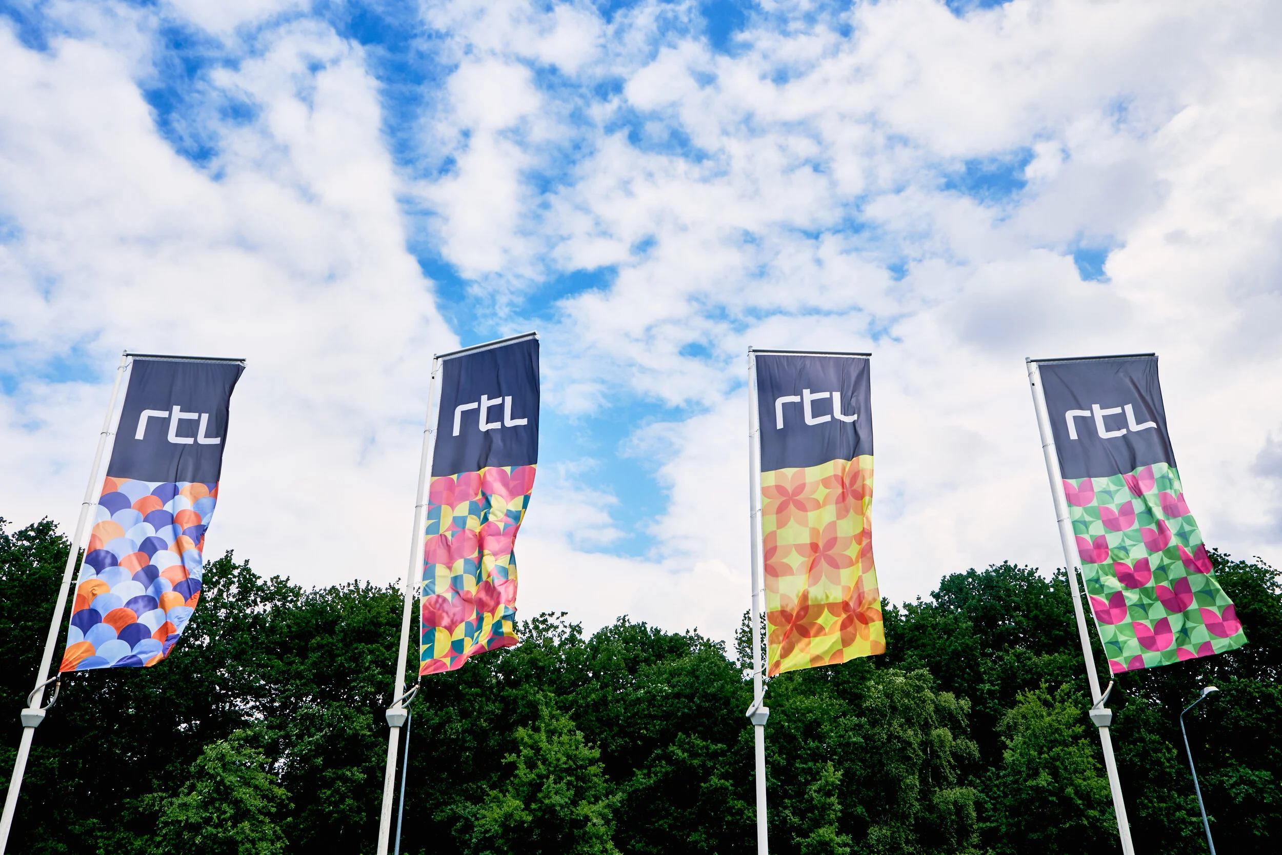
— CHAPTER 4: THE RTL REBRAND
When the RTL Nederland rebrand was initiated, an external design agency had already established the strategic direction. My job was to bring everything they created—new logos, colors, design principles, and illustrations—to life throughout the organization.
That work had three dimensions.
The corporate platform. RTL operated three separate websites for press, careers, and advertising, each catering to a completely different audience. I unified all three within a single corporate environment without losing what made each successful. Acting as both product owner and art director, I assembled a team of a designer, an interaction designer, and developers, then built the new platform from the ground up.
Internal rollout. The rebrand needed to be visible throughout the entire organization. I designed every physical aspect of the new RTL identity: letterheads, business cards, building signage, reception desk, wayfinding, and promotional materials. The assets were provided by the agency; making them into a cohesive presence across every part of the building was my responsibility.
The launch campaign. The commercial introducing the new RTL brand was created by an external agency in Amsterdam. I was actively involved in developing the concept and in the production, making sure the campaign reflected what the rebrand was truly about.
Concept and final creative direction credits go to Natwerk in Amsterdam
— REFLECTION
Six years at RTL taught me that design leadership is rarely about the work itself. It is about creating the conditions in which good work becomes possible.
Building a team that could operate independently, winning trust from a business that needed convincing, assembling the right people for a streaming platform that didn't exist yet, translating a rebrand across every surface of an organisation: none of this showed up in the final designs. But without it, none of the final designs would have been what they were.
The most satisfying moments were not the launches. They were the point where the team no longer needed me to make decisions, and the point where internal clients started coming to us first.